plot
plot is a small, simple and straightforward plotting program for GNU/Linux and MacOSX. plot may be useful to people that love working from within the unix shell, hate herding the mouse around, and need an extremely lightweight plotting program that can read standard input and can be used in unix pipelines. If you would like to be able to type things like
tac mydata.dat | awk '{print $17,$21,$23}' | plot
then keep reading.
The latest version of plot is always available from http://utopia.duth.gr/glykos/progs/plot.tar.gz. The distribution includes source code, documentation, and stand-alone executable images suitable for Linux (32 and 64bit) and MacOSX.
What is new in v.1.3 ?
▶ Large plots for large monitors : set the environmental variable LARGE_LABELS and enjoy the view.
▶ plot can now do three-dimensional matrices, plotting them section-by-section. All sections must be in the same file
and consecutive (without any delimiters). If you have a file containing, say, five sections, you say
plot -s 5 -cc < my3D.map and you will see the first section. Go through the sections with the up-down arrow keys.
Go straight to the last or first section using the page-up and page-down keys.
Simple x-y plots
Assume that in your current working directory you have a file named
test.dat that looks similar to this:
      1    1.2173867    0.2459091    0.5507475    0.6183485   -0.4544818
      2    0.9720144    0.2384075    0.4928420    0.6118929   -0.6186663
      3    1.3854682    0.0986380    0.3309616    0.6049060   -0.5773181
      4    0.8326072    0.1529470    0.5178579    0.1137048   -0.8176309
      5    1.1144494    0.1387347    0.3788721    0.6901881   -0.6738554
      6    1.0761894    0.1671578    0.4417405    0.5298801   -0.6342929
      7    1.0635194    0.3255146    0.5200086    0.5941858   -0.5775796
 ............................
 ............................
 840000    0.1268556    0.6268260   -1.3321012   -0.2615094   -0.9369466
Please do note that the first column is monotonically increasing for this example. This is important because plot uses this property to determine whether it should prepare an x-y plot or a scatter plot (discussed later in this document).
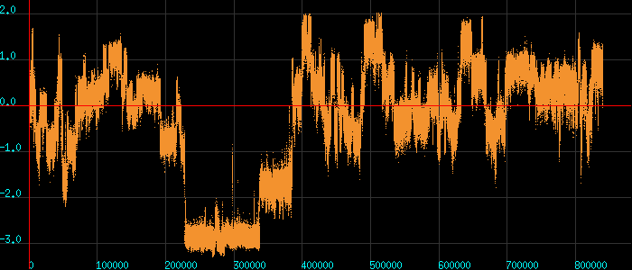
If you type plot < test.dat you will get a simple x-y plot of the first
two columns and you should see something like this :
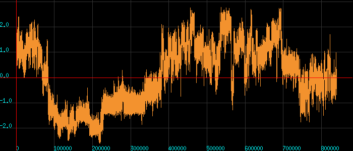
Even if the file contained just one column of data, plot would still prepare a simple x-y plot of that column (the x coordinate would be assigned to an integer ranging from one to the total number of data points).
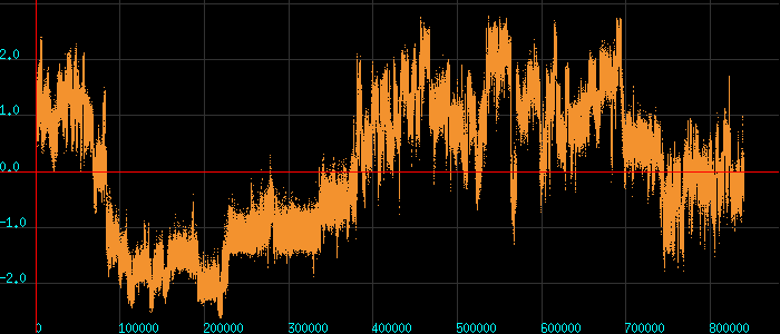
Press the D key to draw points instead of lines :
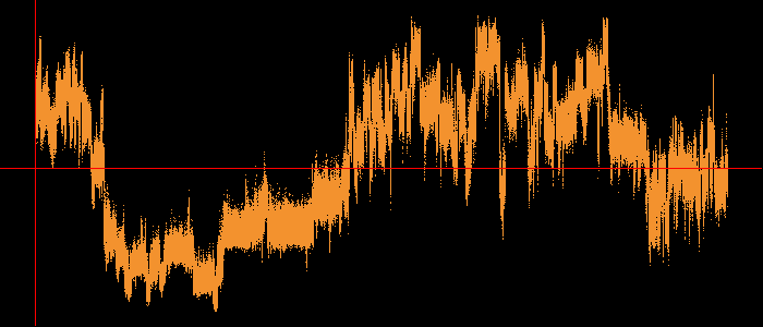
Press the L key to remove/re-add the labels :
Kolmogorov-Zurbenko filtering
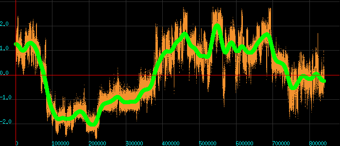
Press the S key to do Kolmogorov-Zurbenko (KZ) smoothing of the data :
While KZ filtering is active, you can increase or decrease the size of the
averaging window by pressing the Z and X keys. See this animation for
an illustration of the effect :
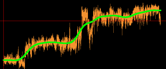
Exit the KZ filtering mode by pressing the key S again. Re-add the labels with
the L key.
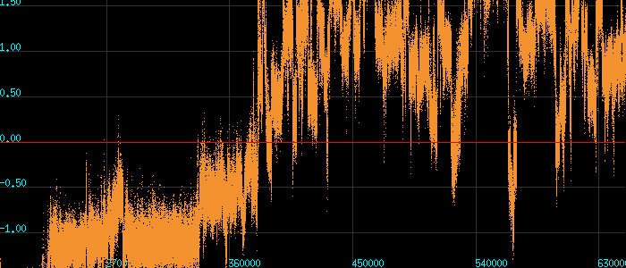
Zooming-in, zooming-out, moving around the plot
Use the PAGE-UP key to zoom-in, the PAGE-DOWN key to zoom-out, and the keyboard's
arrow keys (← , ↑ , → , ↓) to move around. If the number of data points in the plot is large,
use a dots representation (D key) to make plotting go much faster :
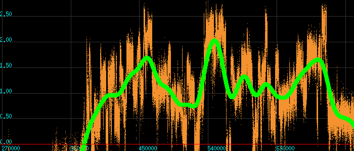
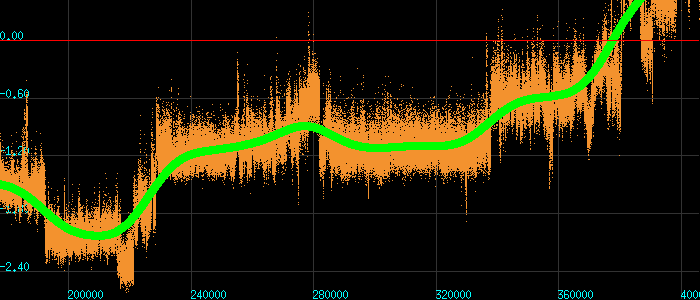
You can at any point add/remove the smoothing (Kolmogorov-Zurbenko) filter
by pressing the S key :
Area of interest, getting the coordinates, and exiting
To select and area of interest of the plot, right-click with the mouse twice to select two
(diagonally opposing) corners of a parallelogram that defines the area of
interest (from example, click the right mouse button once to define the
upper-left-hand corner of the area of interest and then click again the right
mouse button to define the lower-right-hand corner) :
To return to full zoom, right-click twice without moving the mouse (ie.
with the cursor at the same position of the plot).
To get the coordinates of a point of the plot, left-click with the mouse. The
coordinates will be printed in the unix shell.
Press the Q key to quit and return to shell.
Simple x-y plots with a column specification
Continuing with the previous example, assume that you have a file named
test.dat in the current working directory whose contents look like this :
      1    1.2173867    0.2459091    0.5507475    0.6183485   -0.4544818
      2    0.9720144    0.2384075    0.4928420    0.6118929   -0.6186663
      3    1.3854682    0.0986380    0.3309616    0.6049060   -0.5773181
      4    0.8326072    0.1529470    0.5178579    0.1137048   -0.8176309
      5    1.1144494    0.1387347    0.3788721    0.6901881   -0.6738554
      6    1.0761894    0.1671578    0.4417405    0.5298801   -0.6342929
      7    1.0635194    0.3255146    0.5200086    0.5941858   -0.5775796
 ............................
 ............................
 840000    0.1268556    0.6268260   -1.3321012   -0.2615094   -0.9369466
You can select specific columns that you want to plot either through the unix shell (for example, through awk), or directly from plot as follows.
If you type plot -k13 < test.dat you will get an x-y plot of columns 1 and
3 (the graph that follows was produced with the D key pressed) :
Typing plot -k3 < test.dat would have produced the same graph.
Typing plot -k15 < test.dat would have plotted the 1st versus the 5th column.
You can, of course, feed any columns you like through the unix shell. For example
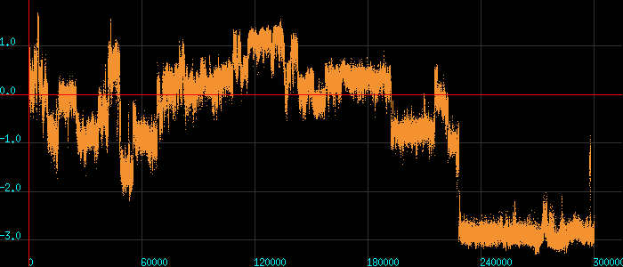
head -300000 test.dat | awk '{print $3}' | plot
will do exactly what you think it will (this is with D key pressed) :
x-y plots with a standard deviations
If you have three columns of data of the form x y σ(y) where σ(y) is the
standard deviation of y, you can tell plot to draw standard deviations.
All you have to do is to include the flag -xydy in the command line. For
example, typing plot -xydy < mydata.dat which will produce graphs similar
to this (after pressing the D and F keys) :
log and log-log plots
If your data are greater than zero you can produce log and log-log plots. If you want a simple log plot (natural logarithm of only the y values), you type:
plot -l < data.dat
If you want a log-log plot (natural logarithm of both the x and y columns), type:
plot -ll < data.dat
You can also do tricks like :
plot -lk13 < data.dat
which will plot column 1 (as is) versus the natural logarithm of column 3. Naturally, completely mystical things like
plot -llk52 < data.dat
will also work [the graph will show a log-log plot of columns 5 (along x) versus column 2 (along y)].
Plotting histograms and cumulative histograms
This is achieved by adding the -h command line flag. The flag -hk can be
used to select specific columns. If you want cumulative histograms use the
flag -hc (you can either use -hk or -hc, not both). The number of
bins is determined automatically using the Freedman-Diaconis rule. Examples
follow.
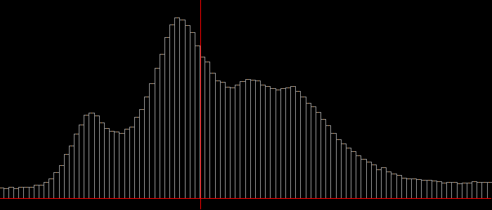
To make a histogram of the first 300000 values contained in the 5th column of the test.dat file :
head -300000 test.dat | awk '{print $5}' | plot -h
Remove the labels (press again the L key), zoom-in using right mouse
clicks to select region of interest, press D to remove line drawing :
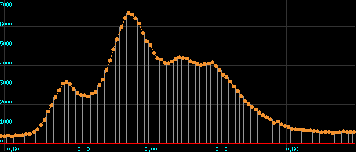
Add labels and filled circles using the keys F and L :
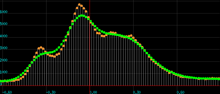
Finally, use keys D and S to add a line drawing and to perform KZ
filtering of the histogram :
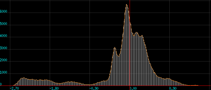
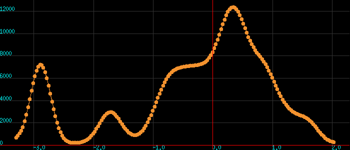
To make a histogram of the 3rd column of the test.dat file :
plot -hk3 < test.dat
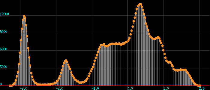
(this was produced after pressing the D and F keys).
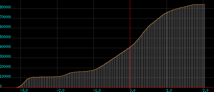
To make a cumulative histogram of the 3rd column of the test.dat file :
awk '{print $3}' test.dat | plot -hc
Saving the graph (plus the results from KZ filtering and histogram creation)
While viewing a graph, press the P key. This will save the current
graphics window contents in a PPM (portable pixmap) file with the name
plot.ppm. If the window contained a KZ filtering graph, the actual numbers
corresponding to the KZ curve will be saved in the current directory in a
file aptly named Kolmogorov_Zurbenko.dat whose contents will look like
this :
# Kolmogorov-Zurbenko filtering with a half-width of 2
  -3.282762      132.247589
  -3.254144      191.820694
  -3.225526      282.352539
  -3.196908      483.616974
  -3.168289      804.197327
  -3.139671     1288.868042
  ...............
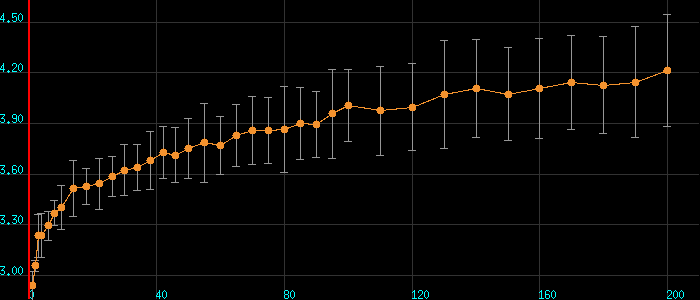
This file can directly be re-plotted with plot < Kolmogorov_Zurbenko.dat,
which after pressing the D and F keys will look similar to this :
If you liked the histogram that plot produced, you can save the
actual (raw) histogram data. The trick for doing this is to re-run
the program with the -hs flag included. For example, the line
awk '{print $3}' test.dat | plot -hs
will not only prepare the histogram of the third column of the file
test.dat, but will also create (in the current working directory)
a file named plot.histogram which will contain the raw data used
by plot. Note that -hs can not be combined with a column selection
via the -k flag.
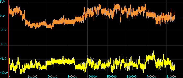
Overlaying two x-y plots
To overlay x-y plots of the columns 1-2 and 1-3 from a file named test.dat type
plot -k123 < test.dat
which (with the D key pressed) would give something like this :
If you wanted to plot columns 1-4 and 1-3 you would have typed something like :
plot -k143 < test.dat
You can, of course, do everything from the shell as well :
head -300000 test.dat | awk '{print $1, $2, $3}' | plot
If the range of values in the two graphs is totally different, then the graphs
produced will not be very informative. plot offers an option that allows
autoscaling the second graph to fit the first by using the -a flag :
plot -a -k157 < test.dat
Compare the following two graphs (without and with the -a flag) :
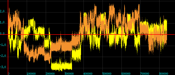
Scatter plots
If the first column of data is not monotonically increasing, then plot will produce a scatter plot of the data. It will also produce two files containing the density (and log density) distribution of the data. These density distributions can be plotted with plot and are discussed in the section entitled "Density distribution of scatter plots".
In the case of a scatter plot the initial window will always be square (but
you can change that by dragging the lower right-hand corner of the graphics
window). Examples using directly plot or the unix shell follow (the key
L for plotting labels works as expected).
plot -k23 < test.dat
will make a scatter plot of the data contained in the columns 2 and 3 of the
file test.dat and will produce something like this :
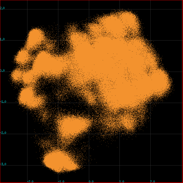
Notice how with such a large number of data points it is impossible to decide which area is the most populated (which explains the need for producing the density and log density distributions).
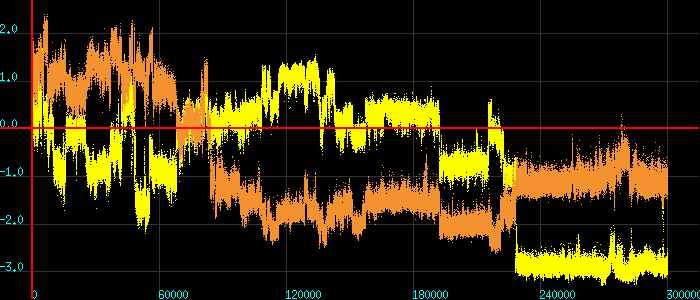
As always, you can feed the data directly through the shell :
tail -300000 test.dat | awk '{print -$4, $3}' | plot
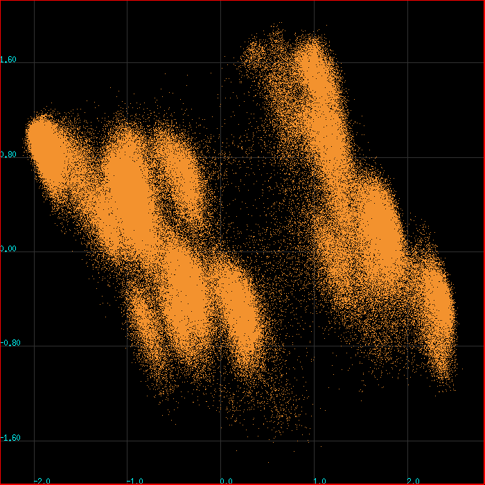
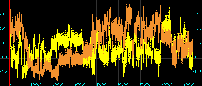
Overlaying two scatter plots
The same way that is used for overlaying two x-y plots can be used to overlay two
scatter plots. The only difference is that you have to press the D key and that
the initial window size is not a square.
Typing (using the example file shown previously)
plot -k234 < test.dat
and then pressing D and resizing the window gives

The -a (autoscaling) flag works with overlayed scatter plots as well.
Visually stepping through scatter plots
You can use the keys + and - to visually step through the data points of
a scatter plot. A cyan-colored filled circle marks the position of the
current point. The number at the lower left of the plot is the index of the
data point being examined (numbering is one-based). This trick will not work
with overlays of scatter plots.

Scatter plots of categorical data
If you feed plot three columns of which the last one is a positive integer, then
the program will assume that you want to make a scatter plot of categorical data
for which the last column (the integer) corresponds to the distinct category.
If, for example, you have a file categorical.dat that looks like this :
   0.8432983 -1.43133 4
   1.0084537 -1.52106 4
   1.0654017 -1.45657 4
   1.2062296 -1.45543 4
   .......
   0.8585105  0.14749 3
   0.7107394 -0.09076 3
   0.0588823 -0.25332 5
and you type plot < categorical.dat you will get something like this :
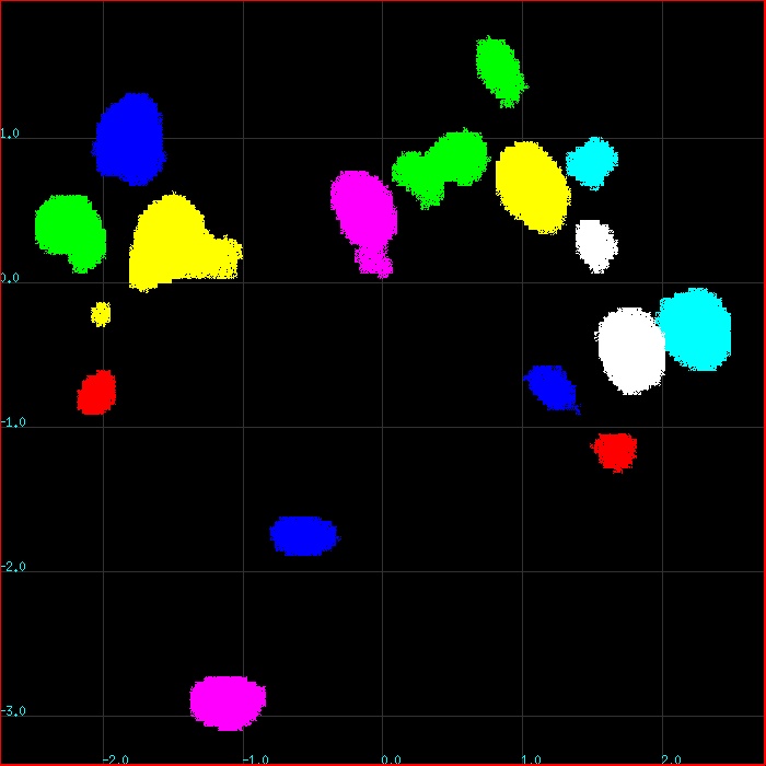
Individual colors represent the various categories but you do not get a unique color for each category unless you have less than eight categories. If the number of categories is eight or more, then plot will cycle through the same set of colors. The order of colors is : "1" → Green, "2" → Yellow, "3" → Blue, "4" → Magenta, "5" → Cyan, "6" → Red, "7" → White, "8" → Green, etc.
This type of plot is only useful with big data sets with clear connectivity (it is very difficult to discern colors of isolated pixels that are randomly scattered).
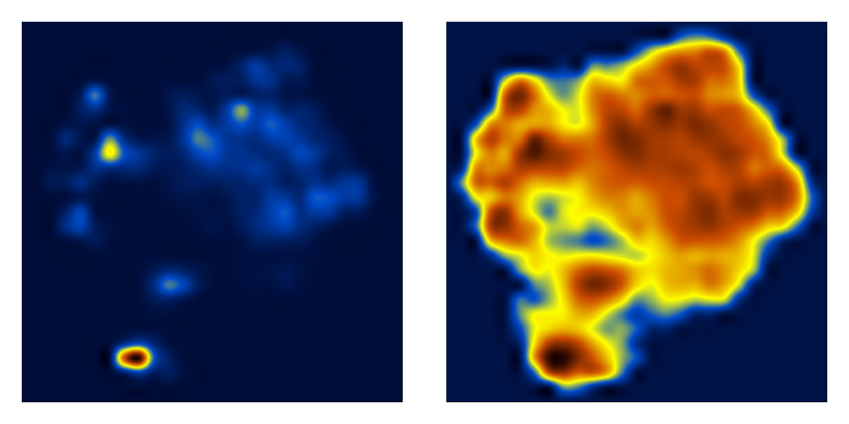
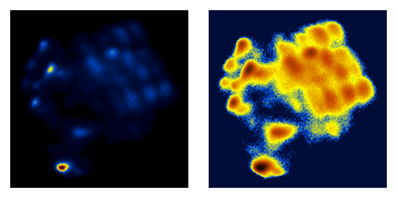
Density distribution of scatter plots
When plot draws a scatter plot, it will automatically prepare (in the current
directory) two new files with the names density.matrix and density.log.matrix.
These are straight ASCII files containing two-dimensional matrices that look
similar to this :
   0        0        0        0        0        0        0        0        0        0    .....
   0        0        0        0        0        0        0        0        0        0    .....
   0        0        0        0        0        0        0        0        0        0    .....
   0        0        0        0        0        0        0        0        2        1    .....
   0        0        0        0       71     1077      226       22       15       32    .....
   0        0        0        0     1872    10349     1605      118       28       97    .....
   0        0        0       11     2253     4056      883      458      133      111    .....
   0        0        7      750     1192      583      665      601      197      121    .....
   0        0      302     3644     1351     1260    12106     3915     1243     1142    .....
   0        0      144     1156      606     5894    18602     8256     5176     2786    .....
   0        2      775      948     1291     4266     4044     3620     3504     1744    .....
   0       20     1512     1883     4182     1582      559      594      660      412    .....
   0        2      128      341     1269      646      115       58       98      166    .....
   0        0        6     2461     6844      712      104       18      103      174    .....
   0        0       11     4218     6837     1884      691       82       74      106    .....
   0        0        1      322     1182     1581      511       59       28       18    .....
   0        0        0        3       38      108      286      163      119      161    .....
   0        0        0        0        0       28      171      129      407     1604    .....
   0        0        0        0        0        1       20       57      384     3866    .....
   0        0        0        0        0       14        9       41      232     1652    .....
   0        0        0        0        1       21      136      162      191      534    .....
   0        0        0        0        0        6      113      288      475      354    .....
   0        0        0        0        0        2      213     4276     7353     3331    .....
   0        0        0        0        0        0      568    27620    36587     9296    .....
   0        0        0        0        0        0       12     2803     6611     1955    .....
   0        0        0        0        0        0        0        0       28       19    .....
   0        0        0        0        0        0        0        0        0        0    .....
   ...........................................................................................
The numbers correspond to the density distribution of the scatter plot. As will be
discussed later, you can plot these matrices directly with plot by saying
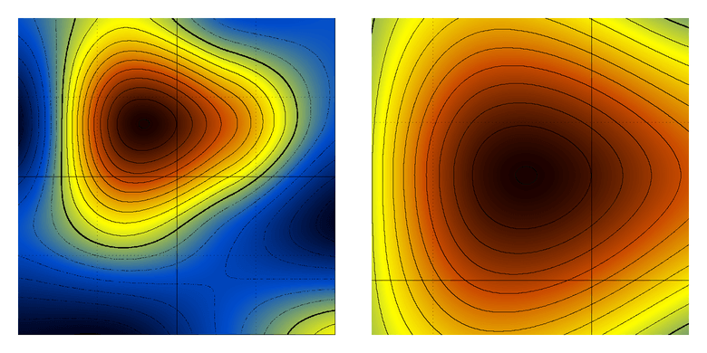
something like plot -cc < density.matrix or plot -cc < density.log.matrix
which will give you graphs similar to those (log density to the right) :
If you feel that the grid selected by plot is too coarse for the resolution that you
need for your application, you can tell plot to produce the same matrices on a
significantly more fine grid by adding the -f flag :
plot -f -k23 < test.dat
The resulting matrices will have a higher resolution, but will also be significantly more noisy :
Matrix plotting
plot can draw matrices using (a) contours, (b) a color representation, or, (c) a combination of both. The nice thing about plot is that it uses bicubic interpolation which allows it to draw even tiny matrices. The matrices plot expects to read are simple ASCII files containing the formatted matrix and nothing else (no header lines, no indices, no dimensions, no nothing, just the matrix). A valid example of a 4x4 matrix would look like this :
   1  2  1  1
   0  4  3  1
   1  2  1  0
   0  0  1  2
Assuming that the 4x4 matrix shown above is contained in a file named
matrix.dat, typing
plot -cc < matrix.dat
will give a color representation like this one :
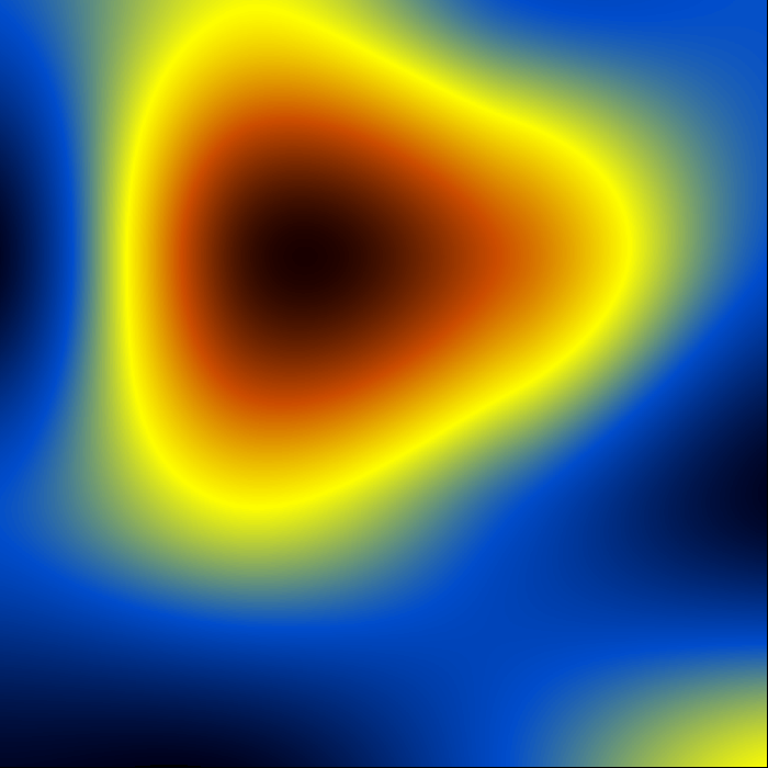
The color representation that plot uses ranges from dark blue (minimum), through yellow, to dark red (maximum).
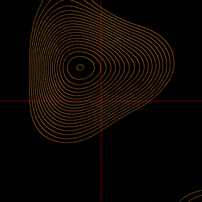
Press the C key and plot will overlay a contour representation. The
program's default is to draw the first contour at (μ+σ/2) and then
successive contours every (σ/2), where (μ) is the mean of the matrix and (σ)
is the RMSD. If you want the contours to cover the whole dynamic range of
the matrix, press the N key and you should see something like this :

The thick line is at (μ), contours every (σ/2), contours below mean are
drawn dotted. The keys - and + can change the interval for contour
plotting : If you press the - key contours will be drawn at double the
previous interval. If you press the + key contours will be drawn at half
the last interval. To make this clear : If -starting from the default- you
press the - key twice, you will be seeing contours drawn at every 2σ
[which is the default (0.5σ) multiplied by a factor of 2 twice].
Conversely, and if starting from the default, you press the + key twice,
you will be seeing contours drawn every 0.125σ [which is the default (0.5σ)
divided by a factor of 2 twice).
Matrix plotting with contours
Continuing with the same example as above, typing
plot -c < matrix.dat
will produce a contour-only representation (this is after pressing the key + a
couple of times :
The keys N, + and - work exactly as described in the previous section.
Matrices : zooming-in, zooming-out and getting the coordinates.
To zoom-in on a matrix place the cursor at the point that you want to
zoom-in and then press the key Z:
Zooming-in on matrices has a depth of only one level (you can not zoom-in again).
To zoom-out press the Z key again.
To get the coordinates of a point place the cursor at that point and
left-click with the mouse. The program will report the fractional coordinates
of that point (values range from 0.0 to 1.0 both along x and y) as well as
the interpolated matrix value at that point. The program will not report
coordinates while in zoom-in mode.
Matrices : saving the bicubic interpolation
If for some reason you want to obtain a copy of the actual interpolated data that plot used for drawing the matrix, you are in business. Type
plot -cv < my_matrix.dat
and plot will write in the current directory a file named bicubic.dat which
will contain the interpolated data in the form of a (rather large) matrix.
Matrices : plotting a submatrix
You can use plot to draw a portion of the matrix given in standard input. If
you want to draw a sub-matrix with dimensions (Dx,Dy) which starts at
position (x0,y0) of the full matrix, use something like this:
plot -ccsDx,Dy,x0,y0 < full.matrix
Note that there must be no spaces in the flag. The combinations
plot -csDx,Dy,x0,y0 < full.matrix
and
plot -cvsDx,Dy,x0,y0 < full.matrix
also work as expected. The coordinates of the origin (x0,y0) are one-based.
Miscellaneous flags
Setting the range along y for x-y plots
To manually set the range along y for an x-y plot use something like this :
plot -r -0.20 3.45 < mydata.dat
Setting the range along z for matrix plotting
To manually set the range along z for a matrix plot use something like this :
plot -r -2.0 6.0 -cc < mymatrix.dat
This will only affect the color representation, the contours will remain unchanged.
Setting the bin width for histogram plotting
To manually set the width of the bins for plotting histograms use something like this :
plot -r 0.5 0 -hk2 < mydata.dat
The first number after the -r flag (0.5 in this case) is the bin width. The second number (zero
in this case) will be ignored but it is nevertheless necessary.
log plot for matrices
If you want to plot the logarithm of the values of a matrix (assuming they are all
greater than zero), use the -l flag described previously :
plot -lcc < mymatrix.dat
or
plot -lc < mymatrix.dat
Propaganda
Yet another plotting program ? Why ? Because I had enough. After two hours of Google-ing, it appeared faster to write it, than to find it: I was looking for a really simple and straightforward x-y plotting program that you could just tell it (from the command line) “plot thisfile” (or even better “plot < thisfile”) and would just go ahead and produce a nice and simple x-y plot (xmgr was my favorite, but it is getting harder and harder to move it to new machines). All programs I found needed half a dozen libraries to get them started, and most of them needed quite a lot of mouse herding around the desktop. So, I gave-up and wrote it. On its way to the present time, plot acquired the ability to draw histograms, contours & pseudo-color representations of matrices, etc., but these were not part of the original plan …
License
                              COPYRIGHT AND PERMISSION NOTICE
                               Copyright © Nicholas M Glykos
                                   All rights reserved.

     Permission is hereby granted, free of charge, to any person obtaining a copy of
     this  software  and associated documentation files (the "Software"), to deal in
     the Software  without  restriction, including  without limitation the rights to
     use,  copy,  modify,  merge,  publish,  distribute,  and/or  sell copies of the
     Software, and to  permit  persons  to whom the Software is furnished  to do so,
     provided that the above copyright notice(s) and  this  permission notice appear
     in all copies of the  Software and that both  the above copyright notice(s) and
     this permission notice appear in supporting documentation.

     THE SOFTWARE IS PROVIDED  "AS IS",  WITHOUT  WARRANTY  OF ANY KIND,  EXPRESS OR
     IMPLIED, INCLUDING BUT  NOT  LIMITED  TO  THE  WARRANTIES  OF  MERCHANTABILITY,
     FITNESS FOR A  PARTICULAR PURPOSE AND NONINFRINGEMENT OF THIRD PARTY RIGHTS. IN
     NO EVENT SHALL  THE COPYRIGHT HOLDER  INCLUDED IN THIS NOTICE BE LIABLE FOR ANY
     CLAIM, OR ANY  SPECIAL  INDIRECT  OR  CONSEQUENTIAL  DAMAGES,  OR  ANY  DAMAGES
     WHATSOEVER RESULTING FROM LOSS OF USE, DATA OR PROFITS, WHETHER IN AN ACTION OF
     CONTRACT, NEGLIGENCE OR OTHER TORTIOUS ACTION, ARISING OUT OF OR IN  CONNECTION
     WITH THE USE OR PERFORMANCE OF THIS SOFTWARE.

     Except as contained in this notice, the name  of  the  copyright  holder  shall
     not be used in advertising or otherwise to  promote  the  sale,  use  or  other
     dealings  in  this  Software  without   prior   written  authorization  of  the
     copyright holder.